Mento Graphics
Taking hero banners and images of the most relevant pages on a website and making them better.
Mento is a startup company that matches you with an executive coach and like-minded peers to accelerate your life and career.
The Problem
The hero banners and images of the homepage and how-it-works page on Mento’s website are the very first thing a customer sees when they access them. The second are the headers of emails that Mento sends out. After noticing several unnecessary and mismatched elements on their website and email headers, I’ve improved the cohesiveness and aesthetic of Mento’s identity while still adhering to branding guidelines.

At a Glance
Upon first visiting the site, I noticed several obvious design errors in terms of formatting and consistency. The designs used are inconsistent between pages–there are simple triangles and circles on the main page but more detailed graphics on the how-it-works page. The home page should be the most eye-catching and memorable so customers are encouraged to stay on the site and continue to explore.
In addition to this, using the site interfaces themselves as graphics is unnecessary, since users will get to experience them firsthand after they sign up. The goal of graphics is to communicate the company mission and goals; in this case, to convey that Mento’s guidance will result in a positive impact in advancing customers’ lives and careers.

Process (site interface)
Based on the existing website, Mento seems to lean toward a generally minimal aesthetic. I chose to sustain the identity that I understood by designing a simple base character that can easily be altered in the future for varying needs.
Since horizontal attention leans left for 80% of users, I split up the screen with the title/call to action on the left, since the information holds higher significance and graphics should supplement the message.
Finally, I wanted to ensure that the graphics matched up with the text on the corresponding page, so users can view the page at a glance and quickly make their next decision.
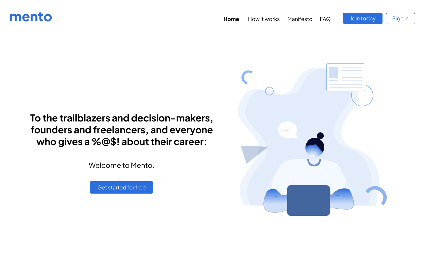
home page redesign.

‘how it works’ redesign.
Process (email marketing)
While considering the redesign of the email header, I aimed to match the style of the website redesign in order to preserve consistency across medias.
Based on this goal, I kept the design minimal and brought over some of the same shapes that were used on the site. The shapes and designs are placed in a way that’s meant to subtly frame the information–the bold gradient above the logo at the top and the ribbon under the phrase “It’s all about you – in the best way.'“ are all intentionally placed so the user:
Immediately recognizes the brand.
Feels like the email has a personal touch and is directed at them.


Final Notes
Mento currently does not have a notable, recognizable brand identity. Their visual aesthetic across medias is lacking cohesiveness and quality. Since it is important to build a trademark style where customers are able to recognize the business quickly, it is in Mento’s best interest to further develop a logo, character, or icon to set them apart from their competitors.
By ensuring that every graphic that exists with the text on the site pages and email header serves a purpose, redesigning the layout and style of each component acts as a tool which keeps users interacting with the media; therefore, more likely to join as a customer.