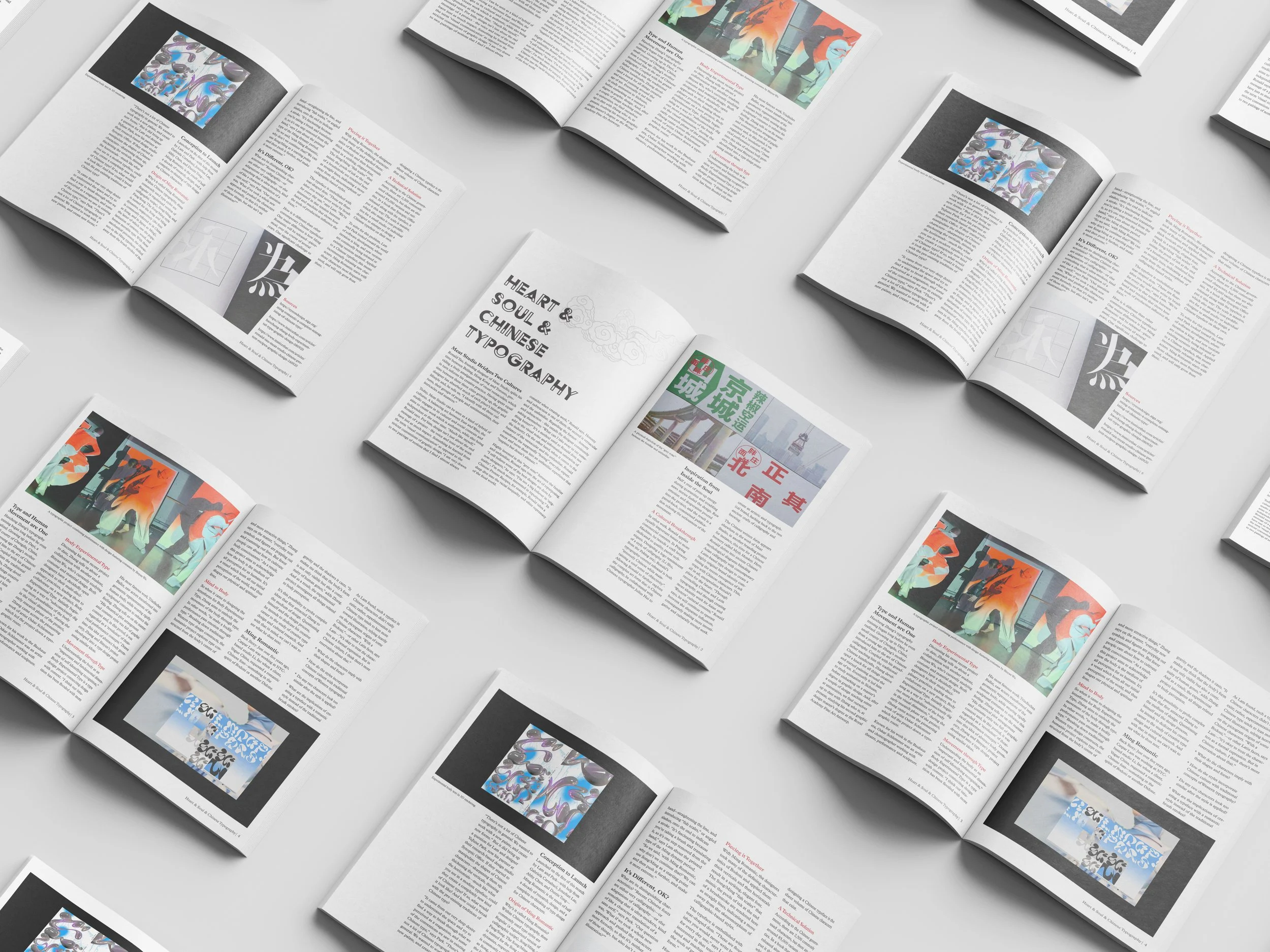
Magazine Layout & Typography
A look into the influence of Chinese characters and culture in Western typography, by Chinese designers.

Concept
I was challenged to design a 6 page magazine layout in order to strengthen my efficiency in InDesign.
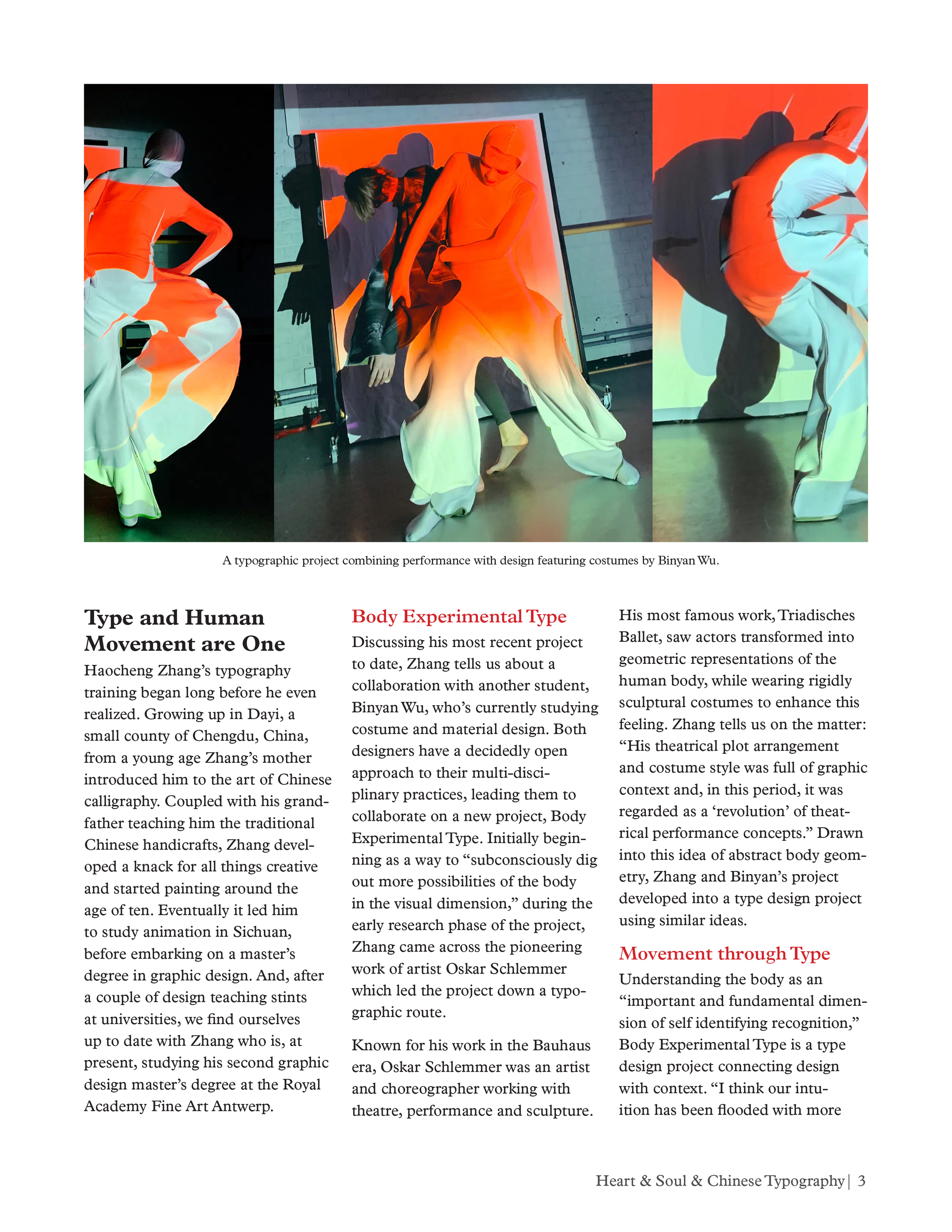
Whenever I get a chance to take creative charge of a project, I am mostly inspired by Asian culture. I ended up taking sections of text from three articles: “Ming Romantic: A Complete Reimagining of Chinese Type,” “Body Experimental Type visualises human movement through typography,” and “Based between Toronto and Beijing, Meat Studio creates work that bridges cultures.”
The focus of this project was to learn the technical rules of typography and layout design while experimenting with grids and font families.


Process
I knew I wanted a minimal look to the spreads, so I chose a serif for the body and headings and a more decorative font for the title. The font used for the title is Acier BAT while the rest of the text uses variations from the font family Plantin MT Pro.
The most challenging aspect was playing with the ratio of images to text. Ensuring that the spreads didn’t become repetitive while still being a cohesive body of work in the end was the most important part of this project.
This was a really fun project for me to start familiarizing myself in InDesign with. It allowed me to explore the crucial tools that are important in saving time and preserving uniformity in my work, while still granting me creative freedoms and a beautiful end product.