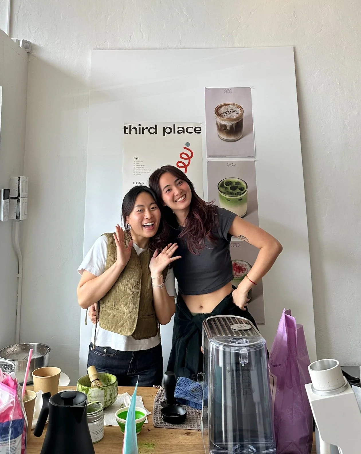
Welcome to Third Place Cafe!
Born out of my passion for the pursuit of the perfect matcha latte and Jihun’s passion for hosting, two designers brought ‘Third Place Cafe’ into fruition.
Both with backgrounds in visual and graphic design, Jihun and I knew we wanted our cafe to support a playful, clean visual aesthetic.
Ground Zero
Step Zero consisted of scrolling through pages of fonts on the web and poster inspiration on Pinterest. We saved anything that looked interesting and compiled it in Illustrator to start envisioning the big picture.
The fonts highlighted in blue were each of our favorites, and we decided on the second option because it felt a lot more dynamic and offered flexibility in placement and orientation on a poster.
Color Palette
Inspired by beautifully plated food, I pulled colors from images of fruit on Pinterest and played around with a color palette generator to select complementary tones. After generating a few options, we decided that we should lean toward a neutral palette with pops of color.
Menu & Poster Design
Menu Design
In order to balance a playful aesthetic with a clean one, I decided to play with abstract shapes for an eye-catching graphic and write out an easily scannable menu with everything listed in a single column.
I wanted the title and graphic to take up space and frame the menu, so I sized them up to fill the space across the top and to the right of the menu. The listed drinks and pastries are numbered to encourage scanning and labelled with ‘sip’ and ‘lil bites’ for clarity.
Poster Design
The poster’s purpose is to incite excitement while displaying essential information for the cafe. I decided to center the shapes and incorporate the name of the cafe within them to create one visual element.
Because the address was listed on personal invites, it wasn’t necessary to include on the poster. The remaining elements needed were the date and the logo. The shapes are grounded with a square, so it made sense not to fill the space underneath with anything. We decided the best placement for maintaining balance on the page was to center with the heaviest visual element (the logo) and have the date split up on either side (march 22, 2025).


